Every year, tertiary institutes publish a school prospectus that showcases and highlights the reasons, benefits, and points of difference to potential students and school leavers moving on to university education.
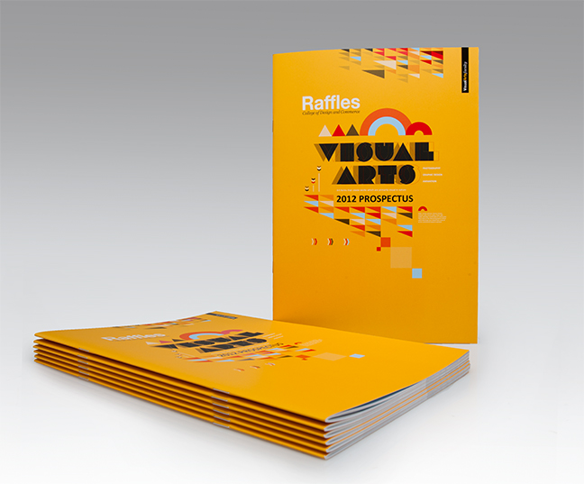
In 2011 I was charged with designing the 2012 Visual Arts Prospectus for Raffles College in Auckland. The document is made to advertise the 3 main courses offered by the School of Visual Arts: Graphic Design, Photography, and Animation.
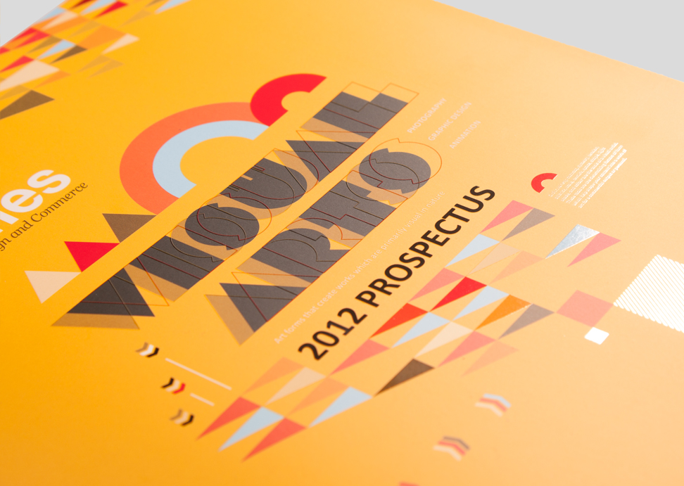
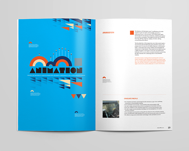
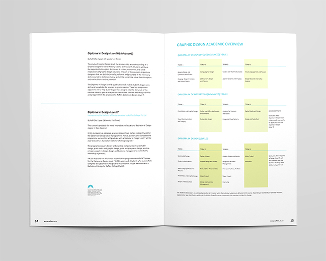
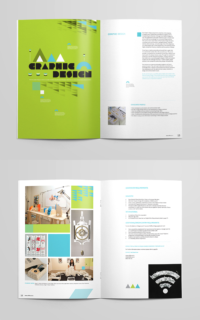
Though the outside of the document is the company’s signature yellow, the inside is a brightly coloured document offset by good use of white space. And not only is it amazing to look at but the information is easy to digest.
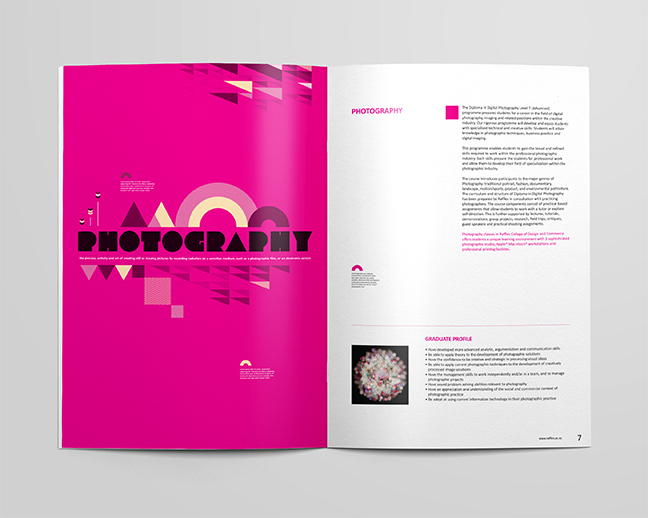
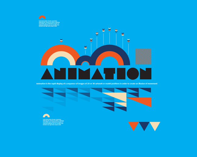
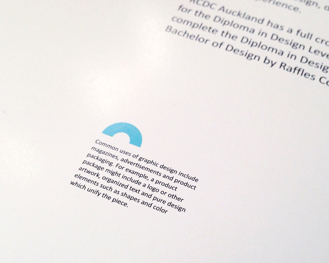
If you look closely at the document there are a few facts relating to each subject scattered throughout each section. Not only is this intended to make for an interesting design, but it also helps to explain more about the field of study.
The use of colour not only acts as a great sub-branding device for the faculties but also cleanly and clearly separates the sections in the document to provide ease of use when referring back to the information provided. Making the contents page almost redundant thanks to the strong use of the bold colours attached to each department in the publication.
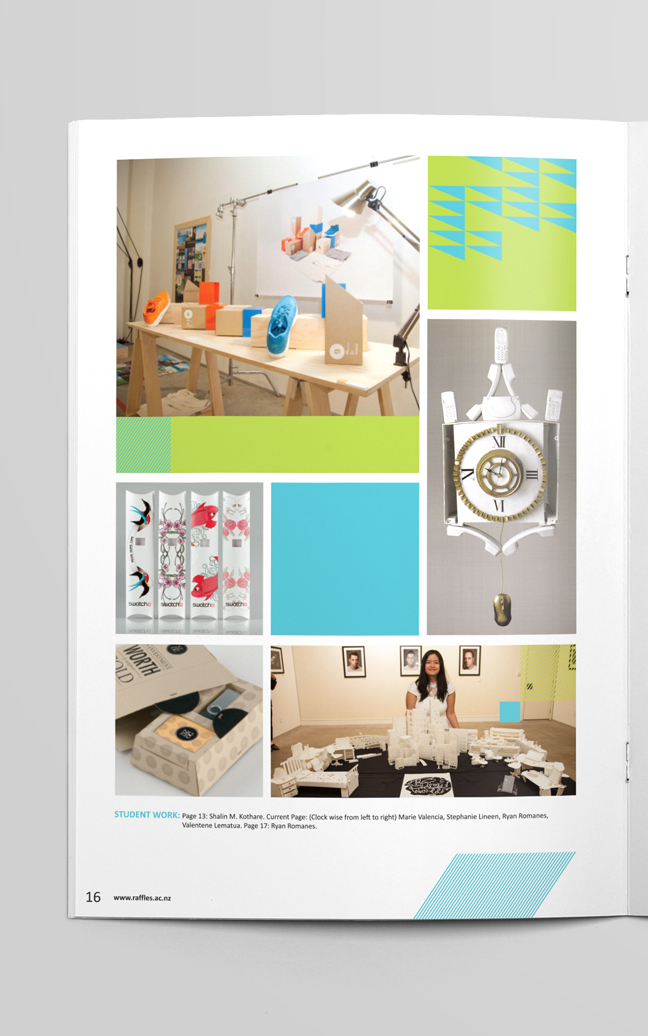
Showcasing the students’ work was a very important key selling point for the College, so a page in each section was solely dedicated to curating the best of the work produced by students in each department from the previous year in order to provide an example of what a student can produce as a student of the school.